





logo
Aymeric
Reddit Data
Yoanna
Proof that we don't suckFeatured on RankInPublicUneed POTW1 BadgeTinyLaunch Badge winner

Get roasted by people who care

Get the kind of feedback no one else will give you, backed by real customer data.
Filip Panoski profile picture
Filip PanoskiFounder of Bazzly
" Haven't seen a tool like this yet, really clever! "
Denis Tarasenko profile picture
Denis TarasenkoFounder of NextNative
" Lutains is the go-to when you're unsure how to boost conversions from your landing page.[...] "
Brice profile picture
BriceFounder of TendX
" I tested Lutains and can say it's a great product with delightful UI/UX. "

THIS FEEDBACK LOOP IS WHERE
PRODUCT GO TO DIE

FRIENDS
“Good work! Are you free on Friday night?”
AI
“You are doing great, you are the best!”
FAMILY
“I'm so proud! I don't get it, but it looks great!”
COMMUNITY
“Great! Can you now try out my product?”

Yoanna & Aymeric, the creators of Lutains

We're builders who got obsessed with why good products don't sell.

We're Yoanna & Aymeric. Like you, we spend our days shipping products. While building Lutains (our SaaS for landing page research), we started helping our peers with their messaging.We quickly realized something: we genuinely love deconstructing what makes a user click— and founders kept seeing things they had missed for months.We’ve now turned that passion into a service. We use our own Reddit data toolsto find your audience’s real pain points, then we manually audityour site to make sure your product speaks their language.

WHAT YOU NEED NOW IS QUALITY FEEDBACK

1

Drop your URL

Give us your URL and eventually the conversion struggle you want us to solve.
2

Audit

We stress-test your offer against Reddit discussions, roast your landing page, and include 2 hero rewrites.
3

Delivery

You receive your actionable teardown in 48 hours max.
4

Rewrite (Optional)

Need us to ship the fixes? Opt in for a complete rewrite.

This is what you will get.


Explore this live roast to see the depth, precision, and actionable recommendations we bring to every audit.

Roast Landing Page Audit
Yoanna

Yoanna

(1)
1

Same thing as above, you can put these links in your footer, but avoid outbound links here. (especially since this adds no value for conversion)

At most, if you want to highlight clients, select more well-known people with a message like: "They are on Indie Chains" with their stats displayed. (e.g.: more than 500 views on their blog each week)
That way, visitors will think "ok, this is serious, I want to join them". You create FOMO.

Or otherwise, showcase successful collaborations, that would be excellent social proof!

↳AymericAymeric

I even think you could completely remove this section. Not sure it serves the landing page.

Yoanna

Yoanna

2

These customer reviews are great! I would rather put them right below the pricing section though, it would help reassure users.

Aymeric

Aymeric

3

It's best to avoid slogans in the title of the pricing section. Keep it simple—here, you need to convert:

Yoanna

Yoanna

(2)
4

This section is great, it really humanizes your product!
However, there are a few issues:

  • You say "I was sick of soulless lists, spam,..." and at the bottom, we can see that you submitted your product to numerous directories, which hurts your credibility in my opinion
    - Then, "If a collaboration goes wrong, you can write to me." That's more scary than reassuring, I think. This text shows that you are accessible to your clients, but what they really want is a guarantee of results. (maybe only paying if the user gets a collaboration that actually works?)
Aymeric

Aymeric

5

You should include screenshots of each step; it would make the section more dynamic. And also use the top image to illustrate the collaboration request (or the screenshot). Also illustrate, using a badge for example, what is premium from what is not.

Agreed by
Yoanna
Yoanna

Yoanna

6

Don't display the numbers if you're below 100, it might be counterproductive. Instead, highlight your 5 stars with your users' photos, it will build much more trust.

Yoanna

Yoanna

7

This CTA doesn't belong here, plus it scrolls us back up the page, which can cause unnecessary frustration.

Agreed by
Aymeric
Aymeric

Aymeric

(1)
8

The titles of the blocks in your “problem” section are great. They’re clear and concise—they’re perfect. However, the descriptions aren’t right.

For one thing, you’re creating a real grammatical disconnect between the declarative style of the title and the imperative style of the description; you absolutely need to harmonize this. For example:

Agreed by
Yoanna
Aymeric

Aymeric

(1)
9

Well, I won't lie to you, there are a few issues here. For the $0 plan, all good. However, regarding the other two plans, there are some real inconsistencies.

  • your product is a matchmaking tool connecting providers/applicants for link exchanges, yet in the premium features you mention... backlinking on your two sites. Why not, but that can't be the top feature to highlight in this case
  • your directory is too small at the moment to allow you to display the number. It's doing you more harm than good right now
  • the one-time payment <> subscription. I think you're shooting your one-time payment in the foot with your subscription plan. What's stopping me from subscribing for one month, building my network, and canceling right away?
Agreed by
Yoanna
Yoanna

Yoanna

(1)
10

It is better to avoid having outbound links like that on your landing page. If a user clicks on them, they will lose track and potentially not return to your site. Ideally, only keep the links that lead to account creation.

Agreed by
Aymeric
Yoanna

Yoanna

11

Huge strong point right there!!! You're adding human-in-the-loop, which is a guarantee of quality compared to all those directories with hundreds of unverified products. You can highlight it much more on your page, it's a real plus!

Yoanna

Yoanna

12

It would make more sense for the black CTA to be "Login" rather than "View Pricing". Users are used to this type of behavior; it's better not to reinvent the wheel here.

Agreed by
Aymeric
Aymeric

Aymeric

13

Quite honestly, I didn't immediately understand what your SaaS does. The context-rich request is confusing and adds unnecessary cognitive load. I understood your tool by reading Tim's feedback. That means two things:

  • Your subheadline isn't clear enough
  • You were right to push that feedback into the hero section
Agreed by
Yoanna
Yoanna

Yoanna

14

You should add a last CTA here, it's your last chance to convert your user. Besides, if they've made it all the way to the bottom of your page, they're probably interested in your product. :)
(put an example text?)

Agreed by
Aymeric
Aymeric

Aymeric

(1)
15

Honestly, I like it, but it dilutes the Hero's message. Your UVP could be summarized as:

A private, verified network allowing founders to get contextual links from manually approved peers, without cold emailing or shady middlemen, in exchange for a badge on their site or a paid subscription.

That's not what your screenshot says. Move it to your how-it-works section.

Simple, fixed pricing.

No subscription · One-time payment · Delivered in 48h.

Tim, the Lutains mascot, saying hello
Standard
$199

$149

Yusuke profile picture
YusukeFounder of LandingBoost
"After implementing some of the feedback from you and Aymeric, LandingBoost picked up 3 new LTD customers within about a week."
Manual UX & Copy Roast by Yoanna & Aymeric
Reddit-Backed Insights (Real buyer verbatims)
48h Async Delivery in your interactive dashboard

Trusted by Builders who needed
an outside perspective.

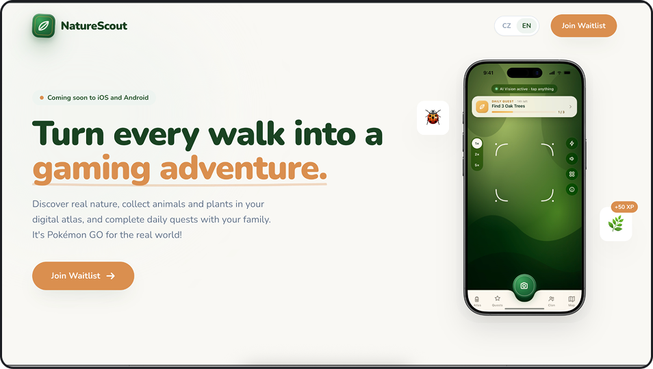
Jiří profile picture
JiříFounder of NatureScout
" Guys, this is really awesome!

Seriously, I really like this draft. I’ve been wanting to revamp the text on the landing page for a while now, I already have a few other versions, but I like these the best so far.
"
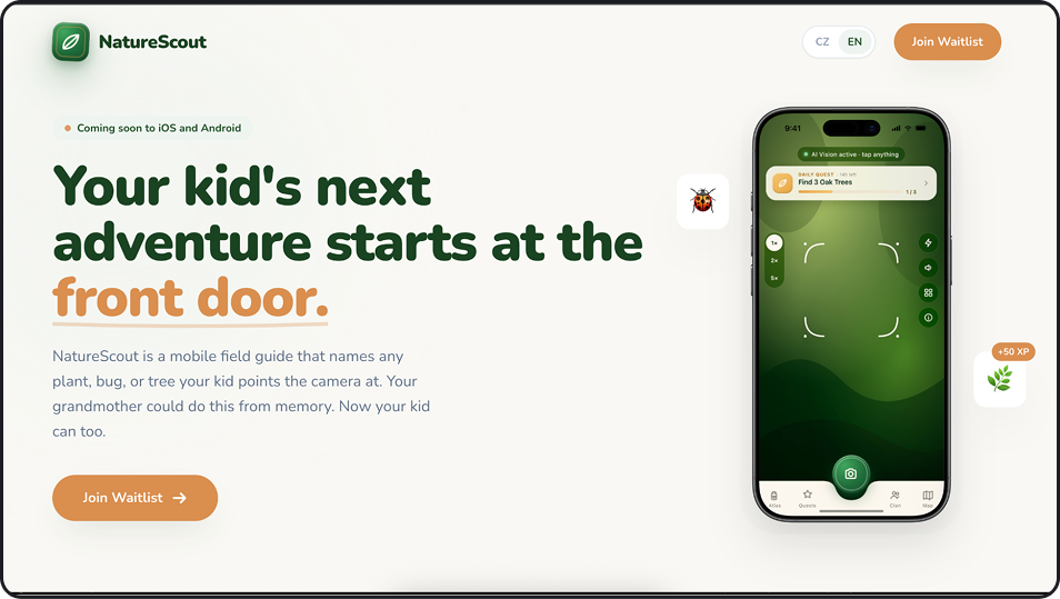
After
Before
Before
After
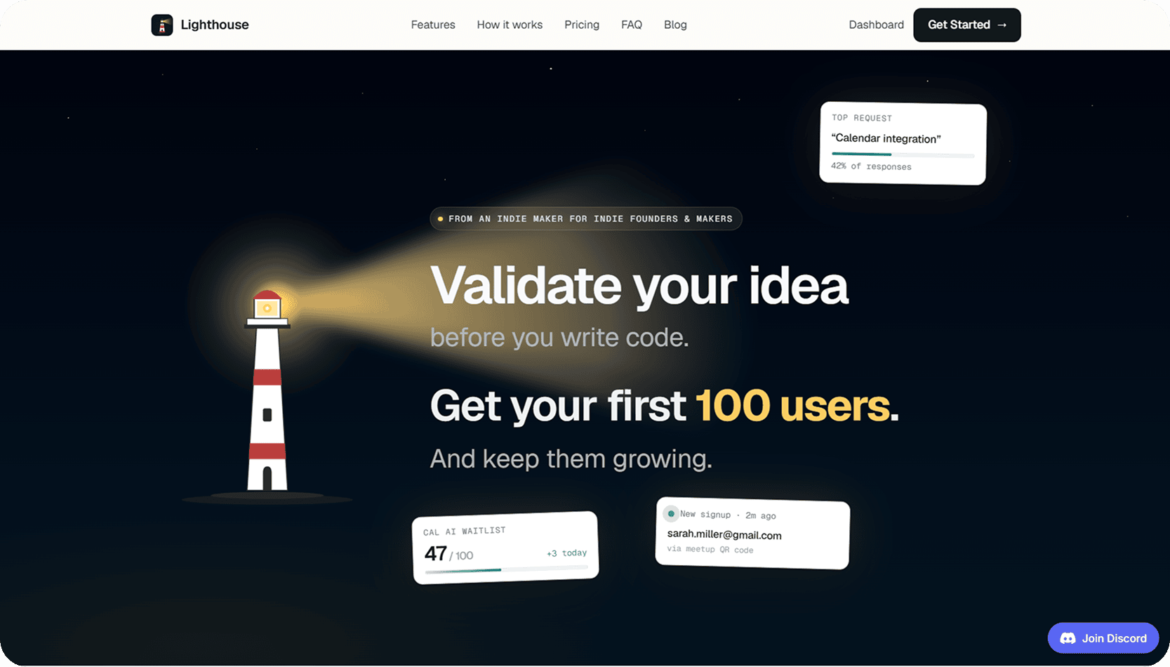
Rouzbeh profile picture
RouzbehFounder of Lighthouse
" The feedback I got on @Lighthouse_app_ saved me weeks of guessing and completely changed how I think about positioning and landing pages.

If you’re building a SaaS and struggling to explain why people should care, it’s worth a look!
"
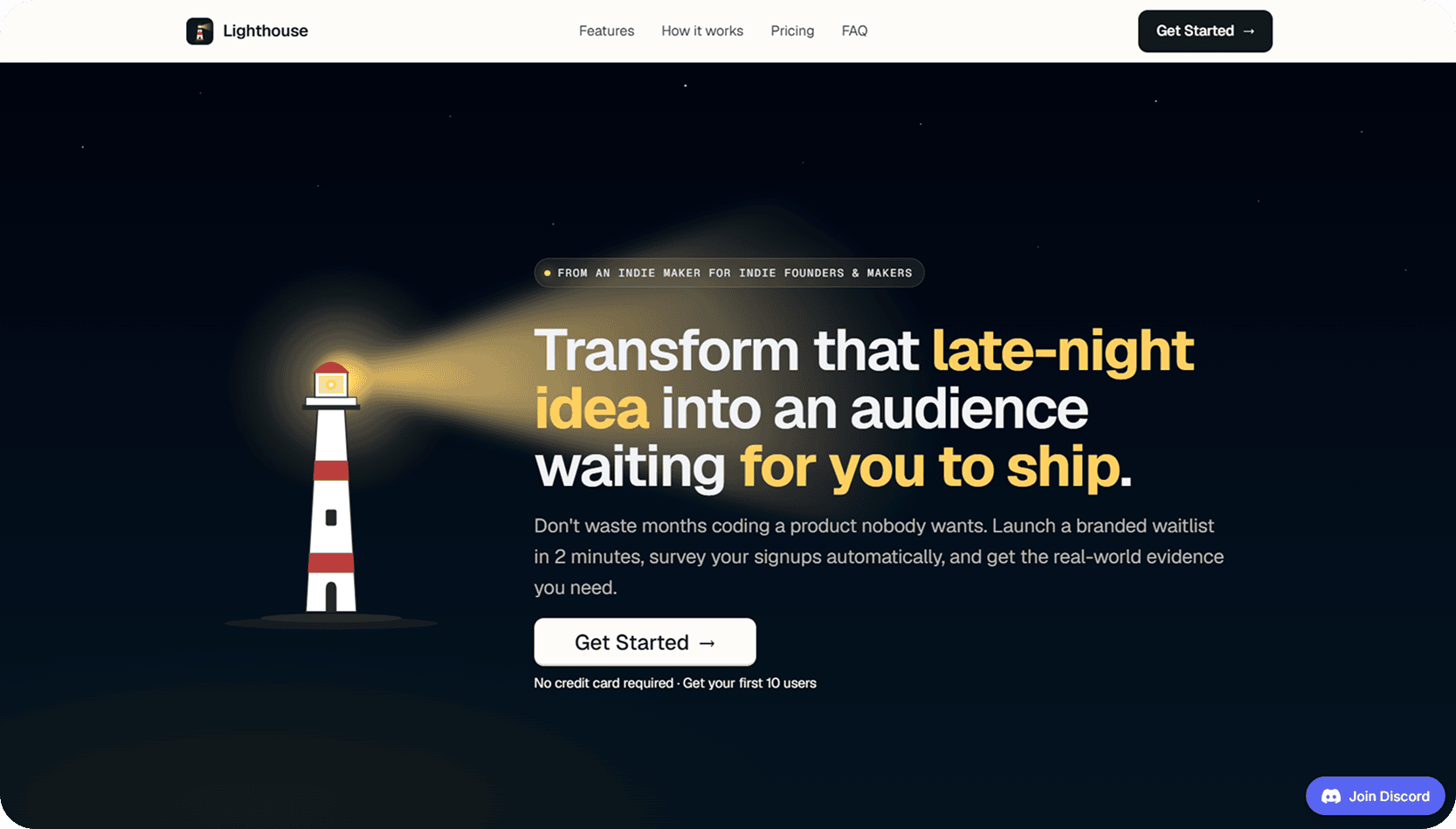
After
Before
Before
After
Tom profile picture
TomCRO Expert
" A true gem.

I've tested quite a few tools in the field, but this one blew me away: the optimization tips are ultra relevant, concrete, and directly actionable. No need to be an expert to implement them, and yet the potential impact is enormous.

What I also loved is the way the tool makes us see our landing page through the eyes of our customers. It's simple, but incredibly effective for boosting conversions.
"
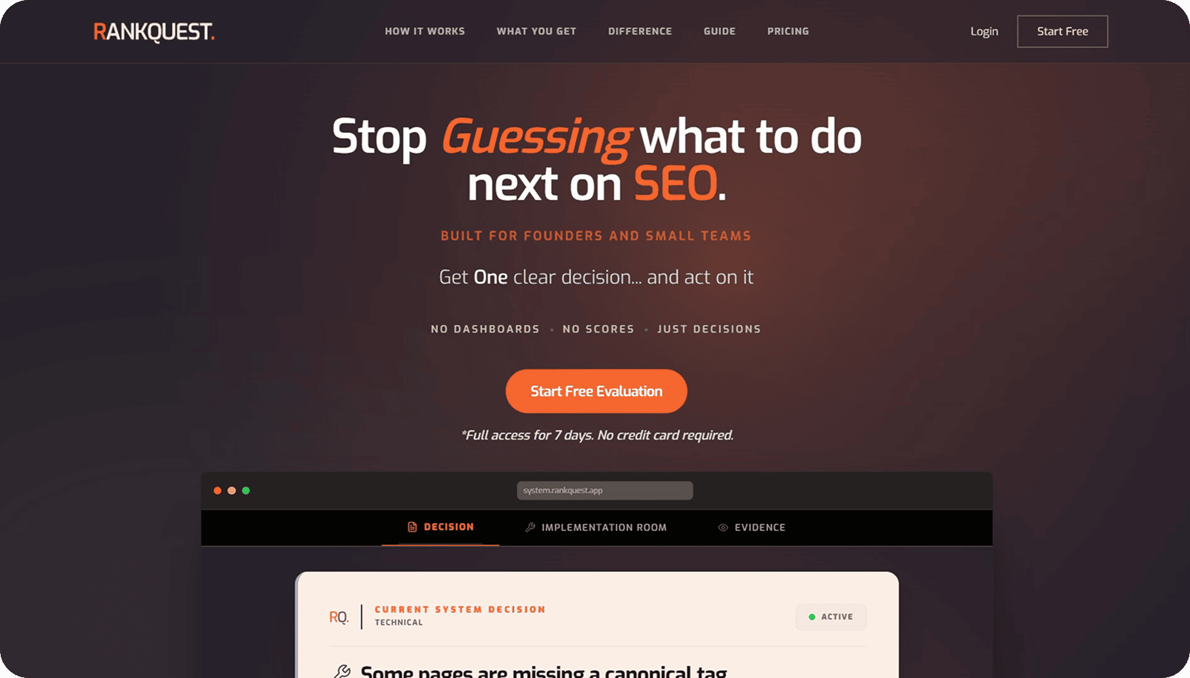
Yannis profile picture
YannisFounder of RankQuest
" Honestly, I should be the one thanking you and Aymeric for taking the time to put together such a thorough human audit ❤️

I was genuinely impressed when I opened the Figma file. The level of detail, the structure, and the way you presented everything made it incredibly easy to understand and act upon. I especially loved the Figma-based feedback approach 👏

Thank you both again for the time and effort you invested into this. It means a lot.
"
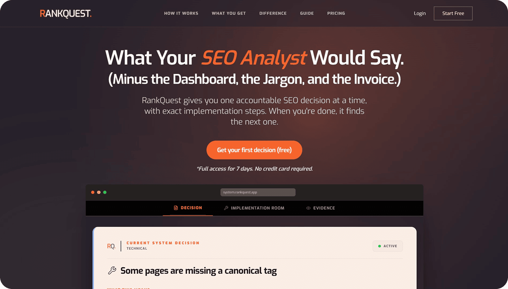
After
Before
Before
After
Tom profile picture
TomFounder of XGrowthEngine
" Phenominal feedback.

You two will do great if this is becoming a paid service offering or addon to existing Lutains. I could see almost every piece as actionable, can't wait to try implementing the updates.

I appreciate every second of time that was put into this, many thanks.
"
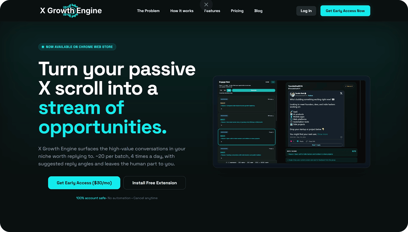
After
Before
Before
After
Pauline profile picture
PaulineUI/UX Designer at Stable Mind
" I tested Lutains on my landing page and loved the experience!

It allowed me to step back from my content, to identify points to clarify or rephrase to better speak to my target.

Big crush on the persona system: super well thought out, you project yourself immediately. And the AI chat is relevant (and honest 😉).
Bravo Yoanna & Aymeric for this gem!!
"
Tim, the Lutains mascot, with a heart

Unsure ?
Let's clear things up.

Is this just another generic AI wrapper generating automated PDFs?
No. We hate generic PDF audits as much as you do.

You get 3 complementary reviews in one pass: 2 real human builders (Yoanna & Aymeric) who manually dissect your UX, copy, and layout frictions + Tim, our agentic CRO engine trained on conversion psychology and Reddit customer research.

Everything is delivered directly inside your own private, interactive Lutains dashboard with clickable pins, verbatim citations, and visual action points.
What exactly do I receive in my interactive dashboard in 48h?
I'm a developer / solo founder. Will I be able to implement the changes easily?
How does the Interactive Roast Q&A (+ $79) add-on work?
What is the Dedicated X Showcase (+ $49) add-on?
What if my product is too niche to find discussions on Reddit?
Who are Yoanna and Aymeric?

GET THE UNFAIR ADVANTAGE
YOUR PRODUCT NEEDS IN 48 HOURS.

Tim ready