
Case Study: Lighthouse
Lighthouse is a genuinely good product: a waitlist, survey, newsletter and feedback toolkit for indie founders and makers, starting at $19/month. Its all-in-one approach is a real strength — and our whole team agreed on that.
The problem wasn’t the product. It was that the page listed features instead of telling a story. Too much information, repetitive sections, and no emotional through-line for the one thing its ideal user actually fears: spending months building something nobody wants. Here’s the full walk-through — how our engine read the page, why we picked the solo maker over the iOS developer, what we pulled from Reddit, the full feedback board from our two-human-one-AI review, and the hero we ended up shipping.
Part 1: The First AI Pass
Every URL we take starts with a blind read. Our crawler digests the page before any of us forms an opinion, so we start from facts instead of vibes.
For Lighthouse, it came back with a clean picture:
- What it is: a waitlist, survey, newsletter and feedback toolkit for indie founders, makers and indie iOS developers.
- The core idea: validate an idea before writing code by pairing a branded waitlist with survey questions, then keep early users engaged after launch.
- Pricing: a 7-day free trial, then Starter at $19/month (unlimited projects, waitlists, surveys, newsletters, feedback collectors, 1,000 emails/month) or Pro at $29/month (adds the full REST API, individual email visibility in-app, custom domains and unlimited campaign sends).
It’s a solid, fairly priced product with a genuinely smart core mechanic. But this first pass only tells us what Lighthouse does — not what makes a tired solo founder actually pay for it.
Part 2: Two Candidate Audiences, One Real Buyer
From the feature set, the engine surfaced two clear profiles:
- The Solo Indie Maker — cares about speed to market and low costs, and doesn’t want to pay for five subscriptions to test an unvalidated idea.
- The Indie iOS Developer — wants a clean REST API to wire waitlists and feedback straight into their app without writing custom endpoints.
Why we set the iOS developer aside
This is exactly where automated tools fail. An AI reviewer tries to write copy that pleases both profiles at once, and ends up speaking to neither.
The call was easy. The iOS developer is a real and valuable user, but their need is technical and rational — they buy the API on the $29 Pro plan once they’ve already decided the product is worth it. They’re not the audience you win or lose at the hero section.
The Solo Indie Maker is. That person arrives anxious, scanning, half-convinced their idea is doomed. So we pointed the whole audit at him. We’ll call him Martin.
Part 3: Finding Martin’s Voice on Reddit
Once we know who we’re writing for, we go find how they actually talk. Using our browser extension, we crawled the indie-maker subreddits to understand what solo founders running early waitlists really go through.
One pain point rose above everything else.
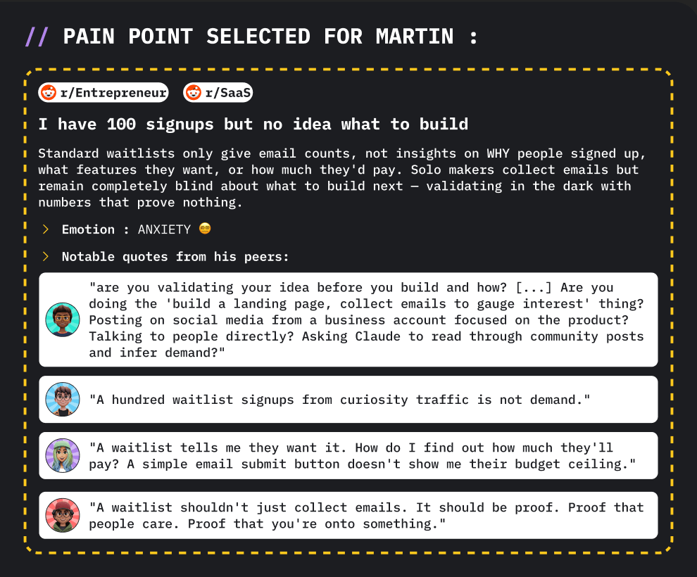
The pain point we selected: “I have 100 signups but no idea what to build.” Standard waitlists only give email counts — not why people signed up, what features they want, or what they’d pay. Solo makers collect emails but stay completely blind about what to build next.
Read the verbatims from Martin’s peers:
“Are you validating your idea before you build and how? […] Are you doing the ‘build a landing page, collect emails to gauge interest’ thing? Posting on social media? Talking to people directly? Asking Claude to read through community posts and infer demand?”
“A hundred waitlist signups from curiosity traffic is not demand.”
“A waitlist tells me they want it. How do I find out how much they’ll pay? A simple email submit button doesn’t show me their budget ceiling.”
“A waitlist shouldn’t just collect emails. It should be proof. Proof that people care. Proof that you’re onto something.”
The emotion here isn’t frustration over software bills. It’s anxiety — the fear of coding in the dark for months and launching to silence. And here’s the thing: Lighthouse already solves that. The survey-infused waitlist is exactly the answer. The product had the cure. The page just wasn’t telling that story.
Part 4: Reading the Page Through Martin’s Eyes
With Martin’s anxiety in mind, we went back to the page and put our notes straight on top of the layout, where you can see what we mean rather than reading a disconnected doc.
The product was strong. The page was the problem:
- It listed features instead of solving a fear. The toolkit does a lot, and the page tried to show all of it at once. Nothing connected to Martin’s actual 3 a.m. worry.
- Too much information, too much repetition. Because the tool covers so many things, several sections said variations of the same thing. There was no editorial spine.
- No emotional hook in the hero. The strongest asset — the all-in-one synergy — was being described, not dramatized.
Part 5: The Three-Way Review (Our Full Board)
To make sure we weren’t tunnel-visioning, we ran our usual review. Yoanna looked at the flow, Aymeric at the structure and CRO, and Tim, our AI agent, went last — on purpose. We always run Tim after we’ve formed our own opinion, never before, so it challenges our thinking instead of anchoring it. Then we laid everything out visually:
What’s already working
- Aymeric: “The all-in-one approach within a unified ecosystem is a smart move. This is your main strength — leverage this synergy.”
- Yoanna: “The project idea is cool and solves a real problem — especially the ‘Three steps to a validated launch’ part. That’s clever.”
- Tim: “‘All-in-one ecosystem’ is your strongest differentiator. We should explicitly call out the outcome — one place to analyze signups → decide what to build → ship it → measure impact — instead of listing disconnected tools.”
Notice all three of us landed in the same place: the all-in-one isn’t the weakness. It’s the wedge. It was just being presented as a pile of features rather than one connected outcome.
What we’d review
- Aymeric: “There’s no mention of the free plan in the pricing, even though users can already create certain elements. That should be spelled out.”
- Yoanna: “The page structure is confusing because there’s simply too much information. The tool covers so many features that it’s hard to stay concise — but you need to make some tough editorial choices. Several sections feel repetitive right now.”
A structure that fixes it: PAS
Yoanna’s main recommendation, echoing Aymeric: Lighthouse is a perfect candidate for a Problem–Agitation–Solution structure. It moves the page away from listing features and toward solving the user’s pain. Concretely:
- Hero
- Problem & Agitation — highlight the risk of building something nobody wants
- Solution (How it works) — merge the “Three Steps” and “Toolkit” sections here
- Pricing — and mention the free plan
- About
- FAQ
- Final CTA
That spine does the heavy lifting: it lets the all-in-one strength shine as an outcome, kills the repetition, and gives Martin a story to follow instead of a catalog to decode.
Part 6: The Hero We Shipped
Once you put it together — the engine’s read, Martin’s words from Reddit, the friction on the page, and the team’s notes — the rewrite stops being a guessing game. Here’s what we landed on:
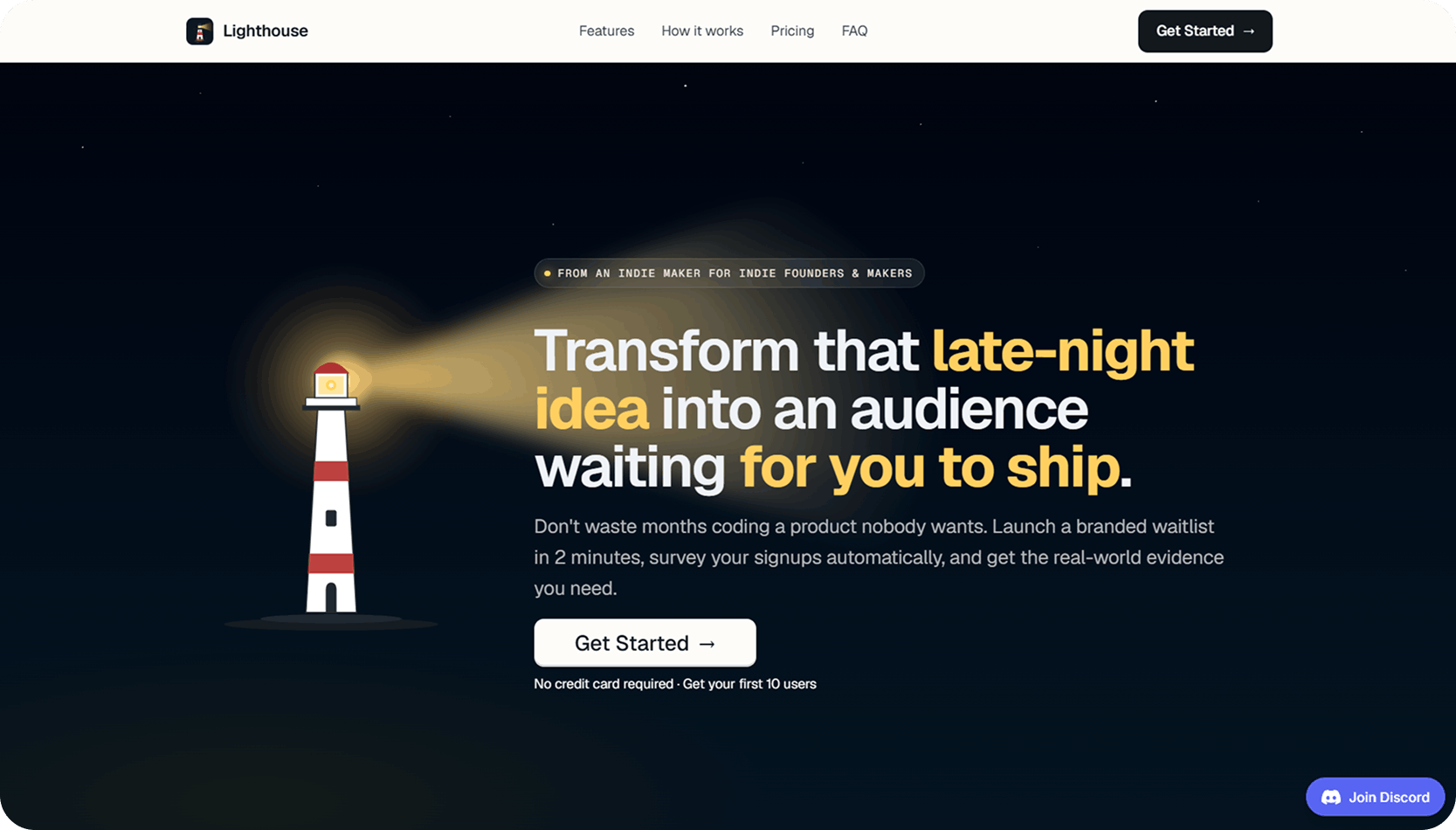
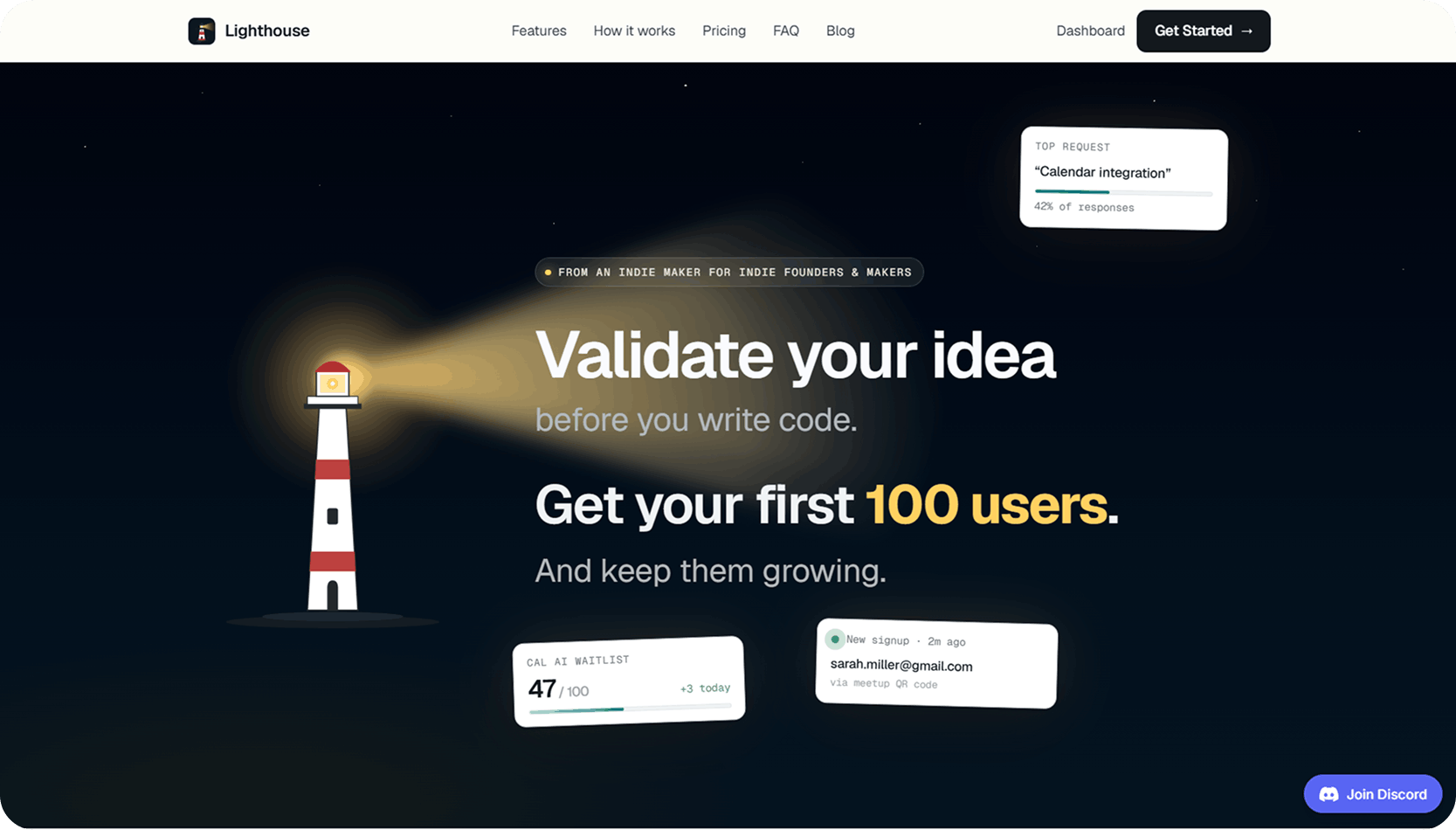
Eyebrow: From an indie maker for indie founders & makers
H1: Transform that late-night idea into an audience waiting for you to ship.
Subhead: Don’t waste months coding a product nobody wants. Launch a branded waitlist in 2 minutes, survey your signups automatically, and get the real-world evidence you need.
Primary CTA: Get Started → Microcopy: No credit card required · Get your first 10 users
Why each line earns its place
- The headline talks to a human, not a user. “Late-night idea” speaks to someone who gets ideas at 3 a.m. They recognize themselves in it instantly — and recognition creates connection.
- The subhead creates contrast. We deliberately juxtapose a heavy pain (coding for months) against a near-instant solution (a waitlist in 2 minutes), then describe exactly what Martin wants: evidence, not faith.
- “First 10,” not 100. Our Reddit data screamed that “100 users” can feel intimidating and abstract to someone still validating. So we aimed at a more tangible, achievable goal. As Seth Godin would put it: first, ten.
Same product. Same price. Same all-in-one strength. We just made the page tell the story Martin was already living.
See the Full Audit
Everything above lives in one place. Here’s the complete, interactive audit we delivered — the feedback board, the annotations, the structure and the hero — exactly as the founder received it:
This is what every Lutains audit looks like: visual, annotated, and built so you can act on it the same day — not a PDF that dies in your inbox.
The Takeaway for Builders
If you’ve got traffic and your Stripe is still at $0, there’s a good chance you’re making Lighthouse’s mistake: you’ve built something genuinely good, but the page is listing what it does instead of telling the story of the fear it removes.
Automated reviewers will tell you to add testimonials and brighten the button. None of that helps when the page has no emotional spine.
You don’t need another checklist. You need to know what your audience says about their problem when you’re not in the room — and then build the page around it.